Magical Women : Cover magic : Asma Kazi on how it was made
This interview was first published on Purple Pencil project here.

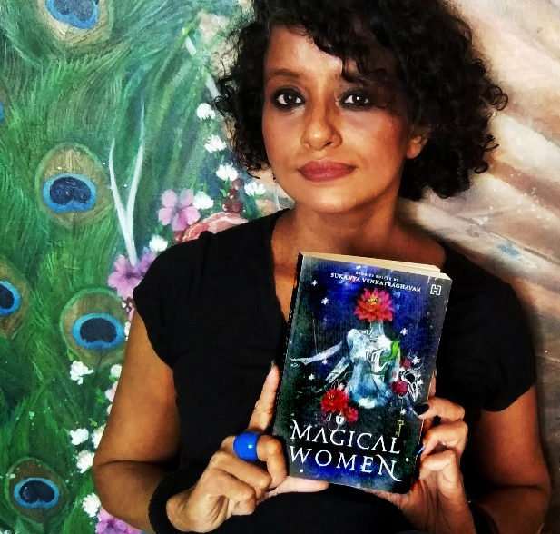
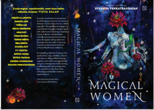
It is impossible to come across the stunning feminist, fantasy fiction anthology Magical Women, and not take a moment to appreciate the cover. It is powerful, intricate and all things awesome, and represents the entire experience of reading the book.

Purple Pencil Project’s Prakruti Maniar spoke to cover artist Asma Kazi via email, to understand not just the cover, but also the role, extents of a cover artist and designer and what it takes to be one. Excerpts:
What was the process of designing the cover – in what order were symbols added to it?
The Lotuses came first. It seemed like the easiest place to start considering everything else looked very abstract & disparate in those early stages. The Lotuses have changed considerably since the first draft, but here they are, still dreamy and heralding the creation of new universes.As part of the design brief I had a list of elements that were vital to each of the stories. The original plan was to have them all on the cover, and they were all on there at some point during the creation process, all very literal, and not so mysterious. The cover evolved though and the redundant elements were removed.The icons that remain on the cover now may seem like they belong to a single story, but they don’t. I keep gushing about how the stories are deeply resonant and *ping* at each other, lighting up across storylines as a glorious breadcrumb trail, and it is the same with the elements in the cover art. They are not only resonant across stories in the anthology but also in a way “talking to” Dark Things, the other cover design project I worked on with Sukanya and Hachette.I do wish I had access to the complete anthology while designing the cover. In an alternate timeline, I would maybe insist on reading all of the stories first, just to observe how that would affect the cover art (and for the bragging rights! I read it first!). It would be quite tough to top this book cover, but one wonders. This cover is perfect in ways I didn’t even imagine it could be.
From among all the art that you create, is book cover among the easier/more difficult forms? How much time did it take to create this one?
Not difficult, but like all commissioned work it is challenging, mostly because I have to give up some control, allow and be open to feedback from others. That can sometimes feel a little restrictive and grating on one’s creative senses. Although, it helps when you’re working with people whose general sense of the creative & whimsy you trust, makes it slightly easier to set aside your resistances and consider other options and opinions.I always learn something new and important from a commissioned project, it is a good opportunity to explore my own creative boundaries.
How important is mass appeal for a book cover? Are there hidden elements on the cover we may be missing out on?
Mass appeal is definitely important. For all the times one has said don’t judge a book by its cover, in an aisle of books, a book literally gets judged (and picked up) for its cover all the time.Having said that, one cannot design to appeal the reader. One can only design a cover that resonates with the general essence of the book, a cover that appeals to you (by you I mean the team here) and pray really hard *hellllooooo you up there! Please let this be the right one* that you being authentic to the vision resonates with the reader as well, and when it does, it’s nothing short of magical.Like in case of Magical Women, we didn’t really know which way it would go. The early reactions to the cover before it went into print were very mixed ones, people either loved it or very politely said they didn’t know what the heck was happening there, and what to make of it. We went ahead with it anyway. The Dark Things cover comparatively was safer and unanimously adored.To me the symbology is pretty obvious on the Magical Women cover and I assume it is obvious for the reader as well, unless someone asks me specifically about the significance of a certain element, in which case I could elaborate. I can however let you in on the trivia of how the artworks for Dark things and the Magical Women are connected.
After I designed the Dark Things cover, Sukanya commissioned me to paint for her a Dark Things inspired painting. The painting is an enchanting landscape complete with a yakshi , ravens, blood blooms and a whole bunch of other wonderland-esque thingamajigs. Some of the ravens from the Dark Things book cover found their way onto some Dark Things candy wrappers, and the candy wrappers became a gorgeous raven-y dress for the Yakshi in the painting. The galactic background from the Dark Things painting became the background for the Magical Women cover, and the wonderland elements that I mentioned above, the magical lock and key, strings of pearls and a raven skull creeped onto the galactic background alongside our new Magical Women bust. I absolutely dig Easter eggs & treasure hunts, and this is my way of commemorating the other work that we have created as a team. It just makes it so much more special and not just another book cover
How has the process and approach of designing book covers evolved since your first cover?
If I speak purely from the technical aspect of it, the actual drawing, usage of tools etc, the process has definitely evolved and is more efficient.From the perspective of actually zeroing in on the final artwork for the Magical Women cover, this is a project that we have been immensely invested in emotionally for a while now.We have sniffed at a gazillion drafts over a bazillion days before arriving at this one that worked for all of us, so I consider this part of the process an anomaly and not any kind of rule of thumb.Dark Things took about two or three drafts to arrive at the final cover concept. Other than the cover art for these two books, I have worked on an illustrated story panel for Joseph Gordon-Levitt’s HitRecord .


The book RECollection: Volume 1 is the very first anthology of hitRECord’s work, a cloth bound tome that is a well crafted & meticulously designed piece of art. It would have been all ho-hum, an illustration in a book that a hundred other artists have contributed to, whatever, but while on this, I had a brief exchange of messages with the man himself.
I couldn’t believe my eyes when the first message from Joseph Gordon-Levitt! Yes! The kid from “3rd Rock from the sun” who grew up to be the “Inception guy” pinged on my screen.
I sat shell shocked on this piece of information for close to a year before doing a song and dance about it. He had written excitedly to say how he loved the artwork and that it was beyond anything he had envisioned for that story panel . That experience was pretty remarkable and still is happy grins inducing.
Is the story in Magical Women your first as a writer? What was that experience like? And did being a writer and cover designer clash at any point?
I have been writing for myself, mostly short essays, for a few years now, most of which is private. Some of the smaller ekphrastic verses and daily ponderings have found their way onto my social media feeds alongside my art.Bahameen, the story I wrote for Magical Women is my first published piece of writing. It is the longest short story I have ever written, and it has been an absolutely glorious adventure. I usually gravitate towards narratives that are unconventional, sometimes bordering on the bizarre, so writing a story that doesn’t follow a linear narrative and is a weird, wonderful and sometimes an intense trip, came to me naturally.The story is the merging of a narrative of magic, time travel and multiverses with contemporary themes of identity, and the inability to fit in with a world that is hostile to any kind of different. It’s a story of a time travel paradox and Nalli Nihari!Writing Bahameen was one very long Miyagi-sanesque Wax-on-Wax-off exercise. I’m so grateful for Sukanya’s guidance through it all.It isn’t norm for writers to be involved in the cover design process, they usually have very little to no say in it, so inputs from 13 other writers wasn’t on the radar at all. That I got to work closely with Sukanya alongside Hachette for both the books is an anomaly in itself, a very fortunate one. I can’t really categorize anything in the working process, for both the cover design and editing, as a conflict. We worked pretty well as a team.
I do however dread even the thought of 15 people (14 writers + the wonderful folks at Hachette) involved in the decision making for a book cover *shudder*I’d step back real slow drop everything and run in the opposite direction real fast. Don’t get me wrong, I think they are the coolest set of women I have gotten to know in the recent times, but that also means 15 x gazillion cool ideas and opinions which is a recipe for disaster. They all do love the cover, and for that I’m ecstatic and immensely grateful
If there was one book you could design a cover for, which one would it be and why? Are there plans to illustrate a book?
Hard-Boiled Wonderland And The End Of The World by Haruki Murakami. I read the book recently and like everything else Murakami it is deliciously twisted, this time quite literally as well with it’s two story tracks running in parallel, intertwined but not connected. So bizarre and magnificent. And what a fun title! That’s why.I do still want to illustrate a complete book, but the right project hasn’t found me yet. There are a couple of personal projects in early planning stages, but I’m not quite ready to bite into them yet. Incidentally someone recently, after reading Bahameen, suggested that I turn it into an edgy-broody graphic novel. Now THAT could be an idea worth exploring, but we’ll see.On that note, if anyone out there has an exciting book they are working on that is in need of lush, enchanting artwork, find me. If books aren’t your thing, and art is, still look me up. You can find my work at www.kaleidodrama.com . And if you haven’t yet, please do read our book Magical Women. It is quite glorious. You can buy it here.


